
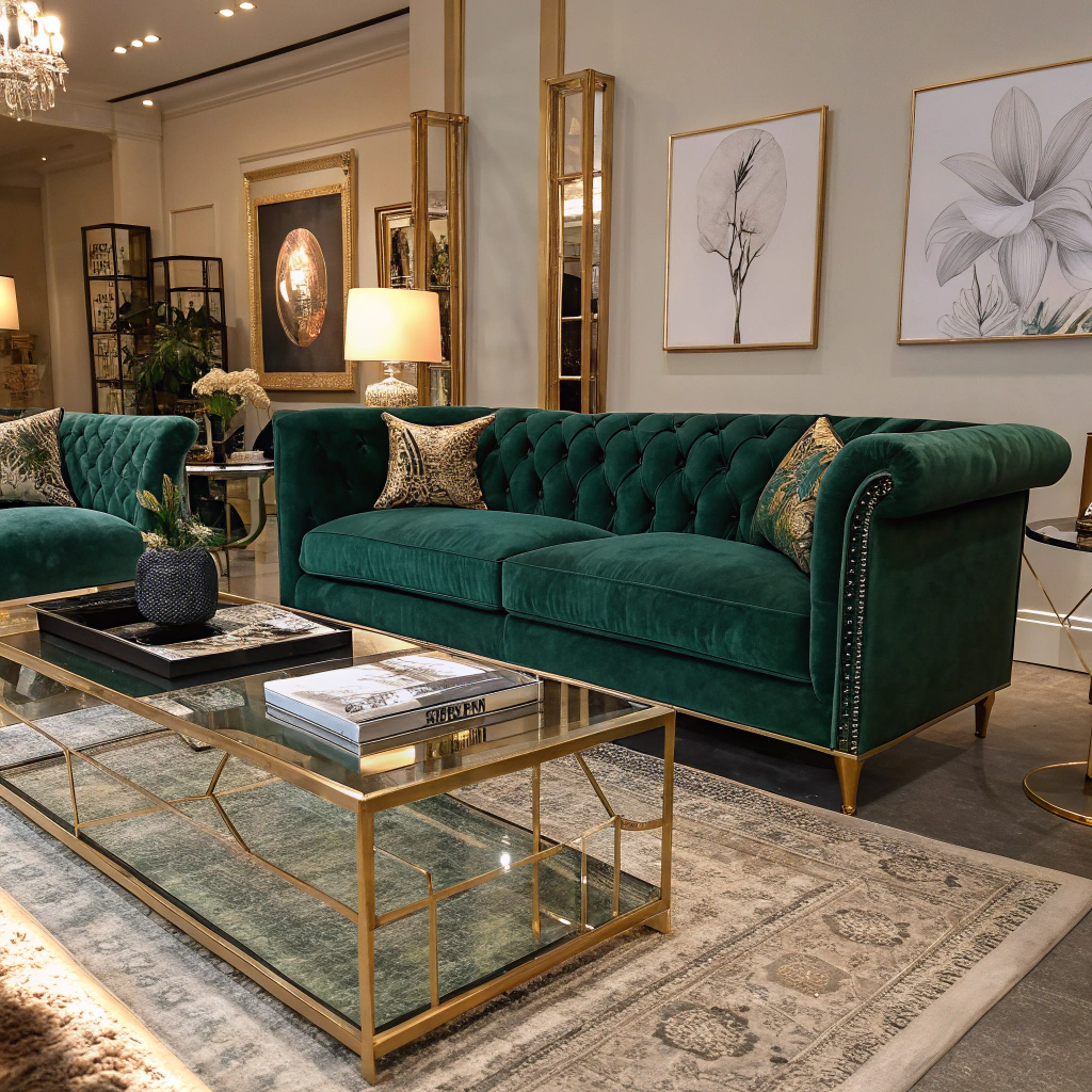
Start with a Signature Hue
Choose one dominant color that reflects the vibe you want—whether it’s classic ruby, icy teal, or a soft ivory. This anchor hue will guide every other element and keep the look from feeling chaotic.
Mix Classic with Contemporary
- Pair deep evergreen with warm metallics like brushed gold or rose‑copper for a luxe feel.
- Introduce neutral tones (cream, taupe, muted gray) to soften the intensity and let the bold accents breathe.
- Add a pop of unexpected color—think dusty mauve or sage green—to modernize the traditional palette.
Layer Textures for Depth
A cohesive color scheme isn’t just about paint; it’s about texture. Combine glossy ornaments, matte velvet ribbons, and natural wood accents. The varied finishes reflect light differently, making the same hue appear richer.
Balance Scale and Placement
- Large pieces (tree skirts, wreaths) should showcase the primary color.
- Smaller accessories (candles, napkins) can carry secondary or accent shades.
- Distribute metallic accents evenly across rooms to tie spaces together without overwhelming the eye.
Curate Your DIY Supplies
When crafting your own décor, stick to the chosen palette. Purchase neutral base fabrics and add colored trims that match your signature hue. This ensures homemade pieces blend seamlessly with store‑bought items.
Final Touches
Finish with coordinated lighting—warm white bulbs for a cozy glow or cool white for a crisp, modern edge. A unified color palette, thoughtful texture mix, and balanced placement will transform any home into an upscale, harmonious holiday haven.